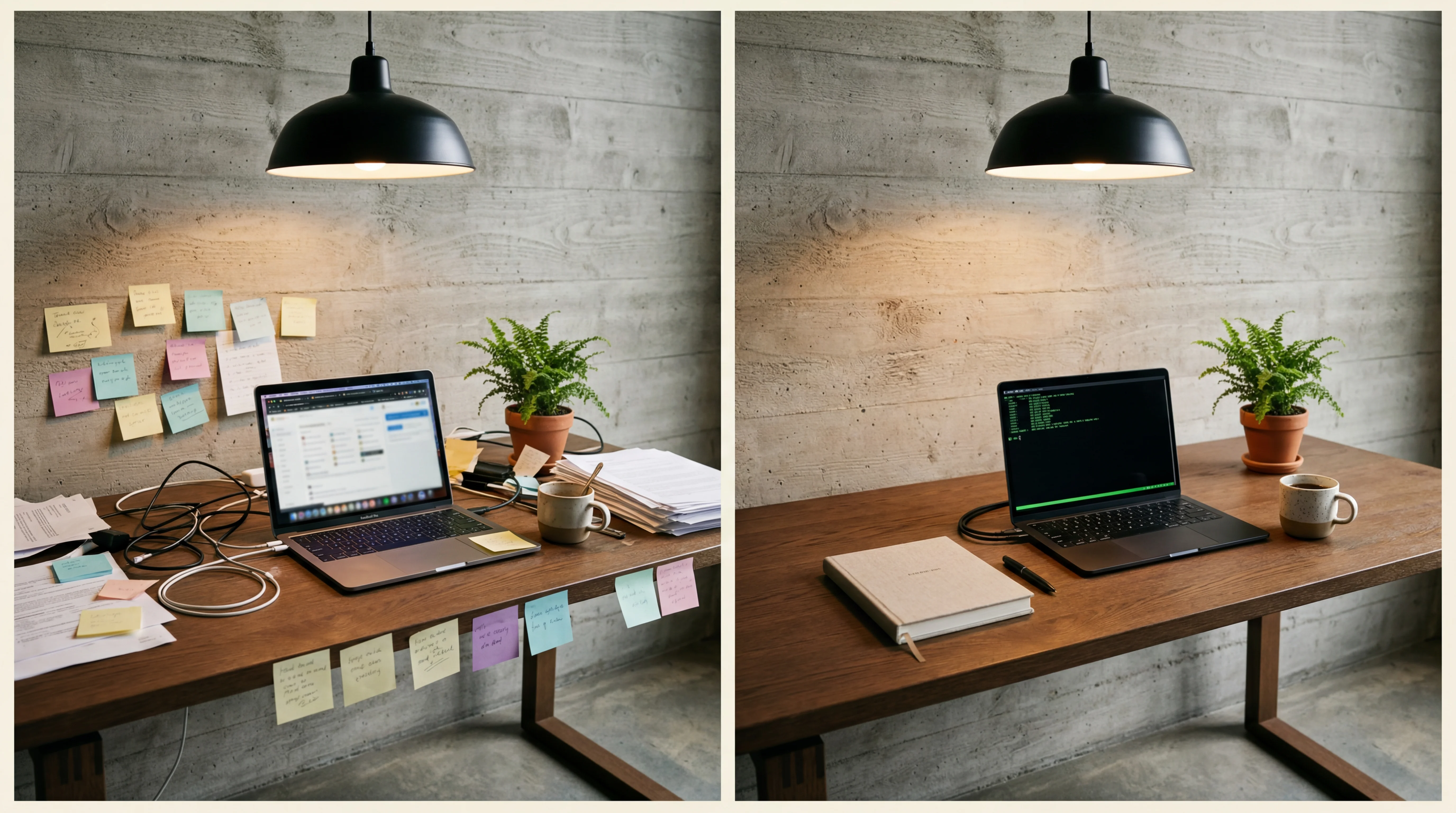
The prompt is the blueprint. A vague blueprint produces a vague building.
Most people learn this the hard way: they type something general, get something generic, then spend twenty minutes correcting. The fix is almost always in the first message. Here are ten real prompts, rewritten, with the reasoning behind each change.
A note on voice: You do not have to type any of this. Click the microphone icon in the Claude desktop app and just talk. Describe what you want the way you would describe it to a friend. Claude understands natural language — you do not need technical terms. The prompts below are written the way you would actually say them.
1. The portfolio page
Before:
Make me a portfolio site.
After:
Build me a portfolio page. My name is Sarah Chen, I’m a photographer. I want my name big at the top with a full-width image behind it, then a grid of my photos below — three across on a computer, one on a phone. When you click a photo it should open up large with a dark background behind it. Keep it cream and dark, quiet and spacious — lots of breathing room, nothing flashy. The font for my name should feel elegant, like a magazine. Open it in my browser when you’re done.
Why it works: Five specific decisions are made in the prompt: layout structure, what happens when you click, colour mood, typography feel, and overall vibe. Claude does not have to guess any of them. The result will be close to right on the first try. Notice: no technical terms. “Elegant, like a magazine” tells Claude more than “serif at 400 weight” ever would.
The principle: Describe the output, not the task.
2. The colour change
Before:
Change the colours.
After:
Change the background to a warm cream colour, and make all the text a dark charcoal instead of black. The headings should be slightly darker than the body text. Keep everything else the same — just the colours.
Why it works: “Change the colours” forces Claude to decide which elements, which colours, and how far to go. It will change things you did not want changed. The rewrite says what to change, what mood, and what to leave alone.
The principle: Say what you want to see, and what you do not want touched.
3. The animation
Before:
Add some animation to make it look better.
After:
Make my photos gently appear as I scroll down the page. Each one should fade in softly, one after another — not all at once. Keep it subtle and slow, like they are arriving rather than popping in. If someone has motion sensitivity turned on in their system settings, skip the animation entirely and just show them.
Why it works: “Some animation” could mean anything from a spinning logo to a parallax background. The rewrite describes the feeling — “gently appear,” “arriving rather than popping in” — and Claude translates that into the right technical approach. You do not need to know what “opacity” or “stagger” means. Claude does.
The principle: Describe how it should feel, not how to build it.
4. The bug fix
Before:
It’s broken. Fix it.
After:
When I click on a photo and it opens up full-size, I can’t close it by clicking on the dark area around the image. I have to click the little X. It should close when I click anywhere outside the photo.
Why it works: “It’s broken” tells Claude nothing. The rewrite says exactly what you tried, what happened, and what should have happened instead. Claude can find and fix the problem from that description alone — you do not need to know what a “click handler” or “overlay element” is.
The principle: Describe what you tried and what went wrong.
5. The responsive layout
Before:
Make it work on mobile.
After:
Make sure this looks good on a phone. On a small screen, the photos should stack in a single column instead of three across. The big hero image at the top should be shorter so people don’t have to scroll past it. When you tap a photo to see it full-size, it should fill the whole screen. Check it by resizing the preview window.
Why it works: “Work on mobile” is a wish. The rewrite describes what you actually want to see on a small screen — stacking, shorter hero, full-screen lightbox. Claude handles the technical details. You described the experience.
The principle: Describe what it should look like on a phone, not how to code it.
6. The new feature
Before:
Add a contact form.
After:
Add a contact section at the bottom. Fields for name, email, and a message. Make it match the rest of the page — same look and feel. It does not need to actually send emails for now — just show a “Thank you, I’ll be in touch” message when someone fills it in and hits send. Keep it simple — no extra services or complicated stuff.
Why it works: Without boundaries, Claude might add email servers, databases, and validation libraries. The prompt says “keep it simple” and “does not need to actually send” — that tells Claude exactly where to stop.
The principle: Say what you do not want as clearly as what you do.
7. The style match
Before:
Make it look more professional.
After:
The page feels a bit loose — like everything is floating. Bring the photos closer together. Make sure my name and the photo grid line up on the left side. Add a thin line between the top section and the photos to give it some structure. But keep it spacious overall — just tighter, not cramped.
Why it works: “Professional” is subjective. The rewrite names the actual problem (“feels loose, floating”), describes the fix in visual terms (“bring closer together,” “line up on the left”), and sets a boundary (“tighter, not cramped”). Claude translates that into the right spacing and alignment.
The principle: Describe the problem you see, not the code you want changed.
8. The iteration
Before:
It’s close but not quite right. Try again.
After:
Almost there. Two things: (1) the font for my name is too chunky — I want something thinner and more elegant, and (2) when I hover over a photo, the zoom effect is too much — make it really subtle, barely noticeable, and slower.
Why it works: “Try again” gives Claude no direction. The rewrite gives two numbered, specific pieces of feedback in plain language. “Too chunky, want thinner” and “too much, make it subtle” — Claude knows exactly what to adjust without you knowing the technical terms.
The principle: Feedback is a numbered list of what feels wrong.
9. The explanation request
Before:
Explain what you did.
After:
Before you make any changes, explain your plan: which files you’ll create or modify, what approach you’ll take for the layout, and why. Then wait for my approval before writing any code.
Why it works: Asking for an explanation after the fact is less useful than asking for a plan before. This prompt activates Plan mode thinking — Claude maps the approach, you approve it, then it executes. Cheaper than undoing work you did not want.
The principle: For complex tasks, plan first, build second.
10. The fresh start
Before:
This isn’t working. Let’s start over.
After:
Start a new approach. Ignore everything we’ve discussed in this session about the layout. Here’s what I actually want: [clear, complete description of the desired outcome, as if this is the first message in a new session].
Why it works: When a session has gone off track, the accumulated context works against you. Claude is trying to reconcile your latest request with everything that came before. This prompt explicitly breaks the chain. Even better: start an entirely new session with a fresh prompt. Context rot is real — a clean start with a clear brief beats a long, confused conversation every time.
The principle: When correcting is harder than restarting, restart.
The pattern
Every rewrite above follows the same structure, whether you use it consciously or not:
- Say where — which part of the page, which section, which thing
- Describe what you want to see — the look, the feel, the behaviour
- Set boundaries — what to leave alone, how far to go, what to avoid
- Use comparisons — “like a magazine,” “more editorial,” “feels like a terminal”
You do not need technical terms. You do not need to know what anything is called. Describe it the way you would describe it to a person standing next to you looking at the same screen.
Talk to it
You can type all of this. But you can also just talk.
Click the microphone icon in the Claude desktop app. Or use voice input on your phone. Describe what you want out loud — “make the heading thinner, move the photos closer together, and add something between the top and the grid, like a line or something” — and Claude does it.
This is vibe coding at its most natural. You are having a conversation with your computer. The better you describe what you see in your head, the closer the result. No jargon required. Just say what you mean.
If you find yourself correcting Claude more than twice on the same point, the problem is usually the description, not Claude. Try again with more detail about what it should look like, not what it should do technically.
Related
- Reverse Prompting: When Claude Asks the Questions — the inverse approach: let Claude interview you instead of describing everything upfront
- Claude Code for Creatives — your first hour, from zero
- The Right AI Tool for Every Creative Task — when to use Claude Code vs Cowork vs ChatGPT
- Context Management in Claude Code — keeping sessions sharp as they get longer (member content)
Art & Algorithms publishes guides, tutorials, and prompt packs at the intersection of art and code. Subscribe for the full archive.