You generated an image. It is sharp. The composition is decent. The colours are fine. But someone looks at it and says, “That’s AI.”
They cannot always tell you why. But they can tell. And if they can tell, your client can tell, and the person scrolling past your portfolio can tell.
There are five specific things that give it away. Once you learn to see them, you cannot unsee them — and you can start fixing them.
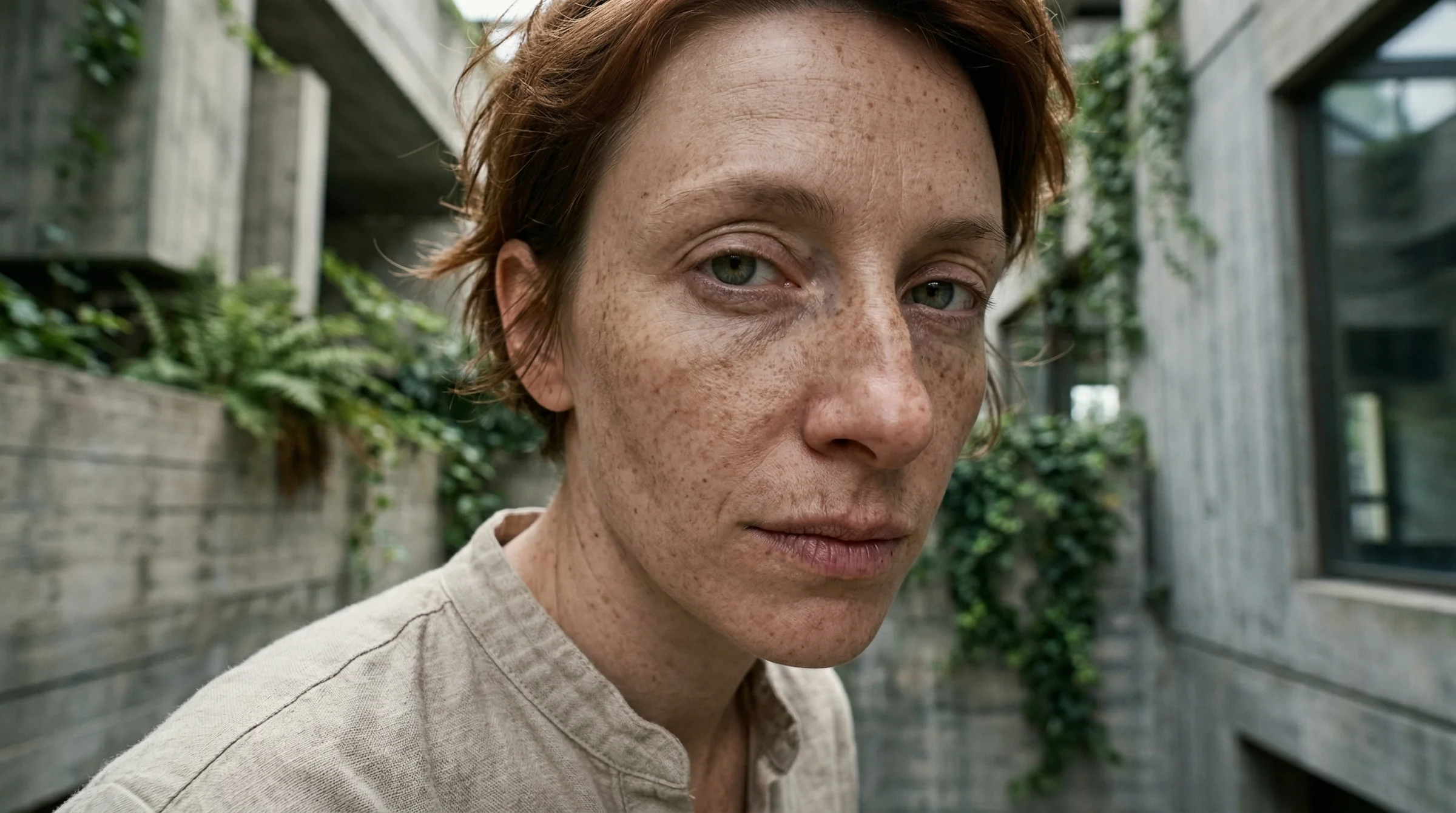
1. The face-averaging problem
AI models learn from millions of faces. When you ask for “a woman in her 30s,” the model produces an average of every woman in her 30s it has ever seen. The result is a face that is technically attractive and completely forgettable — smooth skin, symmetrical features, no distinguishing marks, no character.
Real faces have asymmetry. One eye slightly narrower. A scar. Freckles that cluster unevenly. Pores. The tiny imperfections that make a face feel lived-in.
How to fix it: Be specific about the face. “A woman with a slightly crooked nose, deep smile lines, and a few grey hairs at her temples” produces a face with character. Add imperfections deliberately. If you are working on character consistency across multiple images, these specific features also help the model remember who it is drawing.
2. The light is too perfect
AI-generated images tend toward even, soft, flattering light from no discernible source. It looks like a high-end studio with multiple diffused lights — which sounds good, except that most real photographs are not lit that way. Real light comes from somewhere. It casts shadows in a specific direction. It has colour temperature. It wraps around some objects and misses others.
The “AI look” comes from light that illuminates everything equally with no commitment to a direction.
How to fix it: Name the light source and direction. “Harsh afternoon sun from the upper left, deep shadows on the right side of the face” gives the model a physical lighting setup to simulate. Or reference a specific quality: “the flat grey light of an overcast London afternoon.” The more physically specific your light description, the less the model falls back on its default “pleasant studio lighting.”
Read more on this in the Photographer’s Prompt Guide, which goes deep on how light direction and quality change everything.
3. Texture uniformity
Look at the textures in an AI image. Skin, fabric, metal, wood — they all tend toward the same level of detail and the same surface quality. Real photographs have variation: skin is more detailed than the blurred background fabric; a wooden table has grain that is sharper in the foreground than in the back; a leather jacket has wear marks that a cotton shirt does not.
AI models apply texture evenly across the image because they process the whole thing at once, without the depth-dependent focus that a real camera lens produces.
How to fix it: Ask for depth-of-field explicitly. “Sharp focus on the subject, blurred background” forces different treatment of foreground and background textures. For specific materials, name the wear: “a well-used leather bag with scuffs on the corners” or “a linen shirt that has been washed many times — soft and slightly wrinkled.” Worn things look more real than new things.
4. Compositional symmetry
AI loves to centre things. Subject in the middle. Elements balanced on both sides. Horizon at the halfway point. This produces images that are technically competent and compositionally boring.
Real photography — the kind you would stop scrolling for — uses asymmetry deliberately. Subject offset to one side. Negative space that creates tension. Leading lines that pull the eye somewhere unexpected. The rule of thirds exists because centred compositions are the first instinct of beginners and algorithms alike.
How to fix it: Describe the composition explicitly. “Subject on the left third of the frame, looking toward the empty right side” or “shot from a low angle, subject filling the upper portion with sky above.” If you want something that looks like a real photograph, describe how a photographer would compose it — not how a computer would default to it.
5. The emotional flatness
This is the hardest to articulate and the most damaging. AI images often depict scenes that are technically complete but emotionally empty. A coffee shop scene with people sitting at tables — but nobody looks engaged. A portrait with perfect features — but no expression that suggests an inner life. A landscape that is beautiful and completely unremarkable.
The image is a rendering, not a moment.
How to fix it: Describe the moment, not the scene. “A woman mid-laugh, looking at someone off-camera” is a moment. “A woman smiling” is a pose. “A man running across a street with a newspaper held over his head in the rain” is a moment. “A man in the rain” is a scene. The specificity of the action, the implication that something just happened or is about to happen — this is what makes an image feel alive.
The post-generation edit
Even with perfect prompting, most professional AI images go through a round of editing. This is not cheating — it is the workflow. A photographer does not deliver images straight from the camera.
The common fixes:
- Colour grading. AI images tend toward a specific tonal range. Shifting the highlights or adding a subtle colour cast (warmer shadows, cooler highlights) breaks the “AI palette.”
- Localised adjustments. Darkening the background slightly. Adding a subtle vignette. Drawing attention to the subject through selective contrast.
- Texture overlay. A light film grain or paper texture layered at low intensity can eliminate the “too clean” quality.
- Cropping. The AI’s default composition is almost never the best crop. Reframe for impact.
If you want to build a complete system for taking AI output to professional quality, the Production AI Art Pipeline covers the entire six-stage workflow from generation through delivery.
The real test
Show your image to someone who does not know it is AI-generated. If they assume it is a photograph, you have crossed the line. If they say “is that AI?”, look at the five giveaways above and figure out which one gave it away.
The gap between “obviously AI” and “I cannot tell” is smaller than you think. It is five specific things, each fixable with a more specific prompt or a few minutes of editing. The tools to bridge this gap are available on platforms like Flora Fauna, where you can chain generation, upscaling, and refinement in a single workflow.
The models are not the bottleneck. Your ability to see the problems and describe the fixes — that is the skill.
Related
- Your First AI Image — the basics of describing what you want
- The Photographer’s Prompt Guide — deep dive on light, perspective, and film aesthetics (member content)
- Building a Production AI Art Pipeline — the complete post-generation workflow (member content)
- Character Consistency Across 100 Images — solving the identity drift problem at scale (member content)
Art & Algorithms publishes guides, tutorials, and prompt packs at the intersection of art and code. Subscribe for the full archive.