You have a picture in your head. Maybe it has been there for a while. A figure standing at a window. A shape on a beach. A table, a room, the light falling a certain way. You could try to describe it in words. Or you could pick up a pen.
A rough sketch is one of the most expressive things you can give an AI, and almost nobody does it. The text box gets all the attention. The little picture icon next to it gets ignored. But on every major image model, that icon is where the real shortcut lives.
This article is about what a model does with a sketch, how to take one that works, and which tools actually honour your lines.
What a sketch is, to a model
Start with the thing people get wrong. A sketch is not a drawing that the model is going to trace. It is not a colouring-in exercise. It is not a low-resolution version of the image you want back.
A sketch is a director’s note. You are telling the model where things go. Figure on the left. Window on the right. Horizon low. That’s it. Then the model does the rendering — the light, the materials, the skin, the mood.
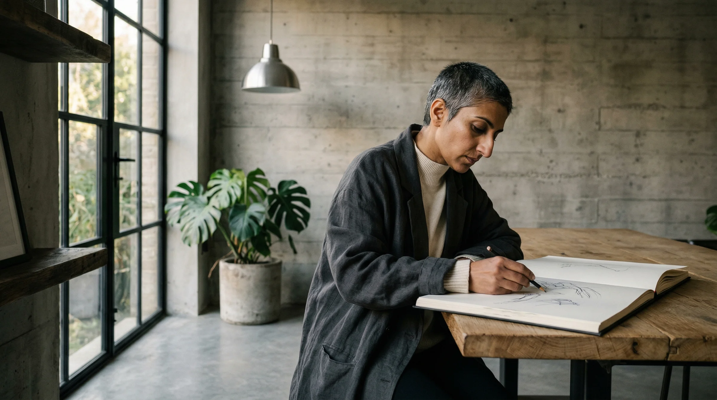
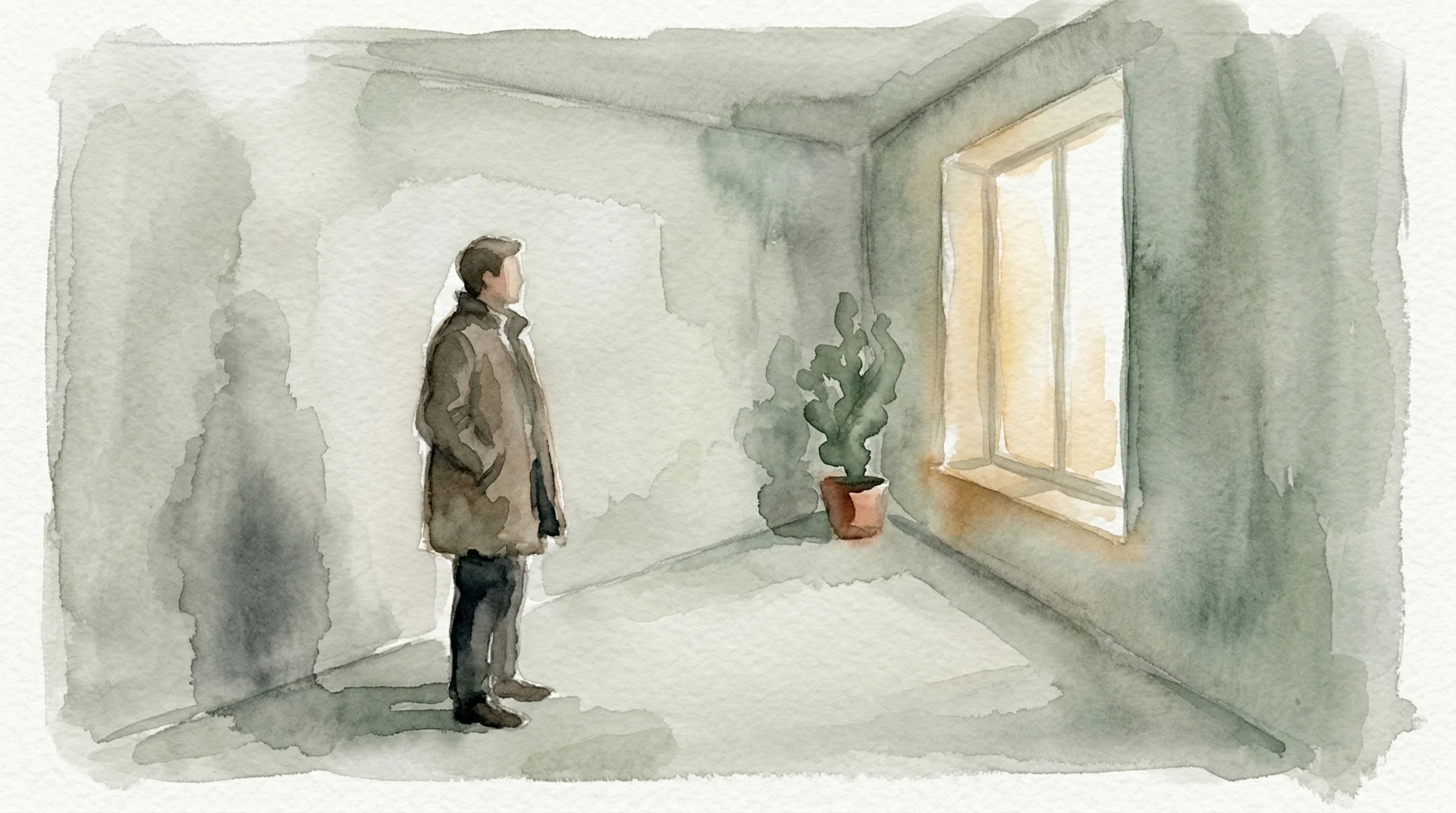
Here is the one I drew for this article.
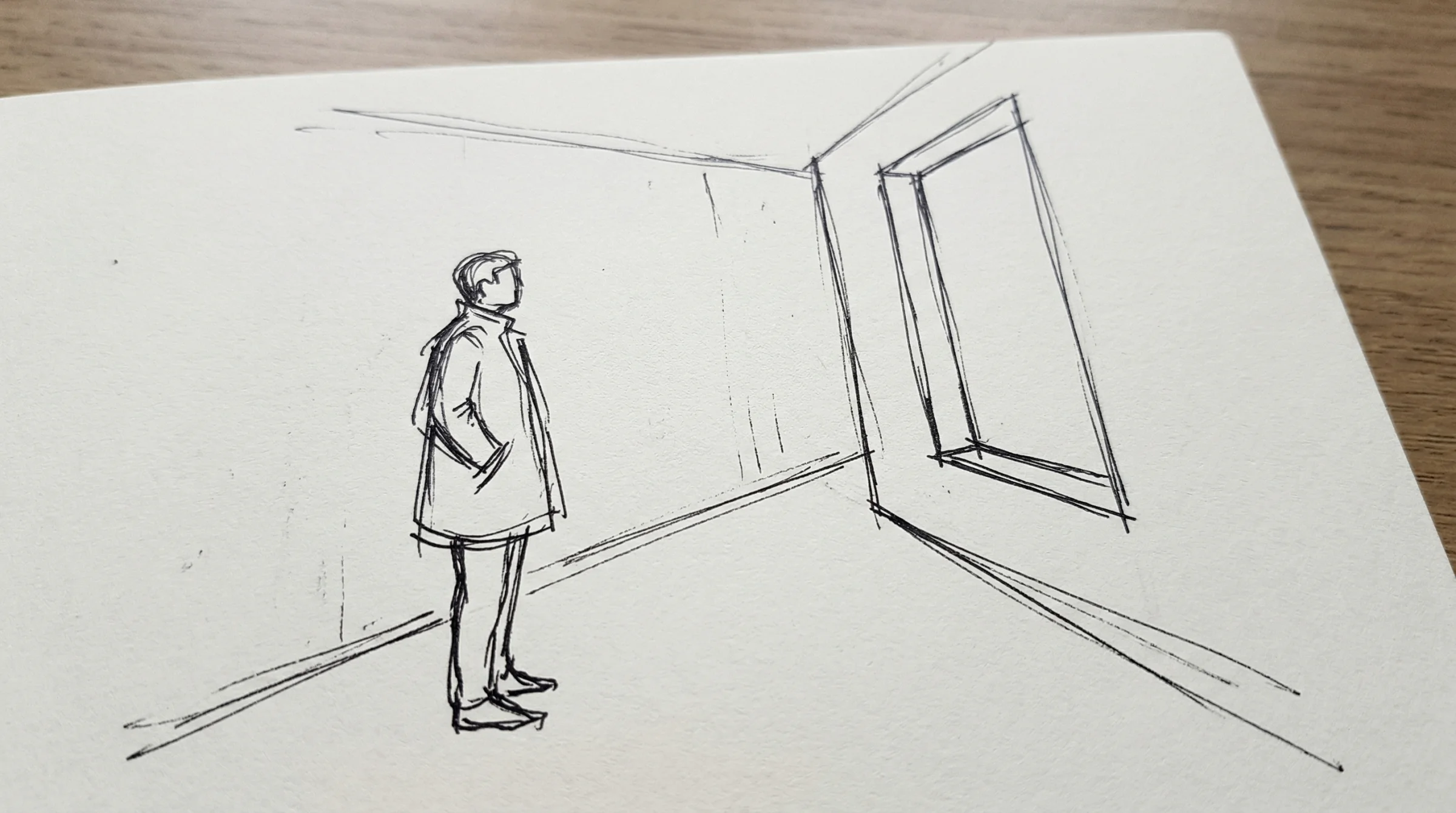
Prompt: A phone photograph of a rough pencil sketch on a piece of plain white paper. The sketch is a loose, expressive line drawing showing a single standing figure in the left third of the frame, facing toward a tall rectangular window in the right third of the frame. A simple concrete corridor is suggested around them with a few quick perspective lines — floor meeting wall, ceiling line, the window cut into the far wall. The figure is drawn with confident gesture lines, head and shoulders and a long coat, no facial detail, no shading, no colour. Black ballpoint pen on slightly textured off-white paper. The paper fills the frame at a slight angle, minimal perspective distortion, even soft daylight across the page, no hand visible, no desk visible. The whole image looks like a napkin sketch someone would photograph to show a friend. No text, no writing, no annotations.
It is not a good drawing. That is the point. The figure is a potato with a coat. The window is four crooked lines. The floor meets the wall wherever I felt like. It took me thirty seconds and it tells the model absolutely everything about the composition I want.
A note on honesty. I did not draw that sketch with my hand. I asked the model to imagine what a phone photo of a rough pencil sketch would look like, so the example is reproducible for anyone reading this. The thesis holds in the other direction too — your own phone photo of your own napkin sketch will work the same way, often better, because it carries the small imperfections a generated sketch smooths over.
One sketch, four images
Now here is the part that matters. I took that one sketch and handed it to the same model four times. Each time I changed nothing about the composition. I only described what I wanted the finished image to feel like.
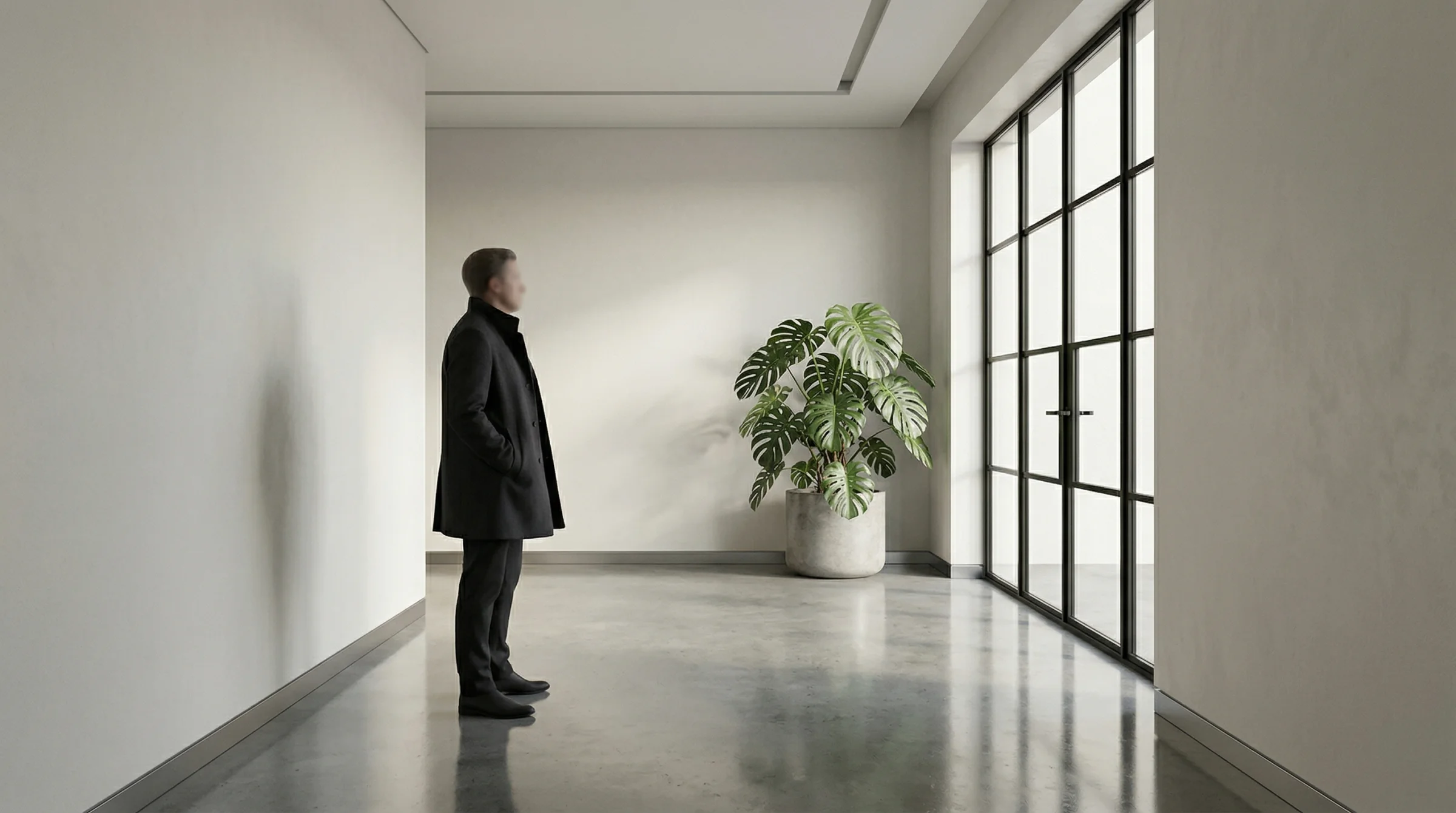
First one: finished photograph, daylight, the house style I use on this site.
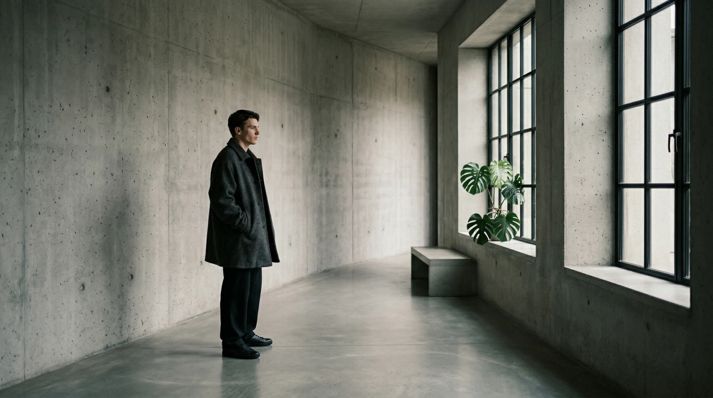
Prompt: Using the attached rough pencil sketch as the compositional reference, render the scene it depicts as a finished image. Preserve the figure placement, the window placement, and the spatial layout from the sketch. Do not copy the sketch’s lines or the paper texture — the sketch is a director’s note, not the final image. A photorealistic editorial image in biophilic brutalist architecture — polished concrete corridor, a tall Crittall-style steel-framed window admitting soft directional daylight from the right, a single sculptural monstera plant. A single figure stands in the left third of the frame wearing an oversized charcoal wool coat, captured candidly, the kind of unconventional editorial face cast for an i-D magazine cover, mid-thought, looking toward the window. Elevated chiaroscuro lighting with lifted blacks, matte dark slate shadows. Natural skin texture. Captured on a Leica Q3 with a 24mm lens, Kodak Portra 400 film with lifted shadows and matte finish. No text.
Look at what carried through. The figure is exactly where my pen left it — left third, facing right. The window is on the right wall. The corridor has the same depth. The man is even wearing a long coat. I did not ask for a long coat in the render prompt. It is there because it was in the sketch.
The model did not trace my lines. It understood them.
Second one: same sketch, now it is night.
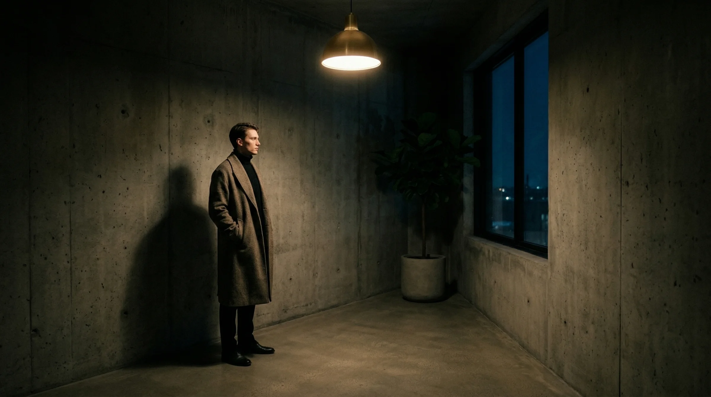
Prompt: Using the attached rough pencil sketch as the compositional reference, render the scene it depicts as a finished image. Preserve the figure placement, the window placement, and the spatial layout from the sketch. Do not copy the sketch’s lines or the paper texture — the sketch is a director’s note, not the final image. A moody night scene in biophilic brutalist architecture — polished concrete corridor, a tall dark steel-framed window showing a faint blue-black sky outside, a single brass pendant lamp casting warm pooled light from above, one sculptural fiddle-leaf fig in silhouette. A single figure stands in the left third of the frame in a black high-neck knit and long draped wool coat, captured candidly, the kind of unconventional editorial face cast for an i-D magazine cover, quiet intensity. Deep matte shadows, lifted blacks, tungsten warmth from the lamp only. Captured on a Sony A7R V with a 24mm lens at f/2, CineStill 800T film with soft halation around the light source. No text.
Same figure placement. Same window position. The composition is locked. Everything else — the time of day, the light source, the film stock, the mood — is new. That is the part of the image I controlled with words. The part I controlled with the sketch has not moved.
Third one: paint it.
Prompt: Using the attached rough pencil sketch as the compositional reference, render the scene it depicts as a finished image. Preserve the figure placement, the window placement, and the spatial layout from the sketch. Do not copy the sketch’s lines or the paper texture — the sketch is a director’s note, not the final image. A soft watercolour illustration in muted earth tones — a concrete corridor suggested in loose washes of grey and sage, a tall window in the right third with pale golden light bleeding through, a single sculptural plant in the corner. A single figure in the left third of the frame in a long soft-edged coat, loose brushwork, no hard outlines, the paper texture of traditional watercolour showing through, calm meditative mood. Painterly, not photographic. No text.
This is the one I find most persuasive. I did not describe a painting — I did not ask for brushstrokes or pigment or wet-on-wet bleed. I asked for “a soft watercolour illustration” and the model filled in every detail of what that meant. But it did not move the figure. It did not move the window. It understood that the sketch was non-negotiable and the medium was the thing I wanted changed.
Fourth one: clean it up, make it an architect’s rendering.
Prompt: Using the attached rough pencil sketch as the compositional reference, render the scene it depicts as a finished image. Preserve the figure placement, the window placement, and the spatial layout from the sketch. Do not copy the sketch’s lines or the paper texture — the sketch is a director’s note, not the final image. A clean architectural visualisation — smooth polished concrete corridor rendered with accurate material reflections, a tall Crittall steel-framed window on the right admitting daylight, one large monstera in a concrete planter, even ambient light with subtle directional shadow. A single figure stands in the left third of the frame as a neutrally-lit scale reference, wearing a simple dark coat, face not detailed. Photorealistic architectural rendering, 24mm wide perspective, daylight exposure balanced, the kind of image an architect would present to a client. No text.
Four completely different images. One sketch. That is the thing I want you to see.
If you had tried to get these four images from text alone — “a figure in the left third of a concrete corridor, window on the right” — you would have got four different compositions. The figure would have drifted. The window would have changed size. The corridor would have turned into a room. Each generation would have been its own guess.
The sketch is what stops the drift. It is thirty seconds of work that does the job of a paragraph of careful description, and does it better.
Which models actually accept sketches
Not equally. Some treat a sketch as structural guidance — the lines define where things go, and the model builds around them. Others treat a sketch as an aesthetic reference — they see “a sketch” and try to make the output look sketchy. Those are two different things, and the difference matters.
Here is where each of the main models stood as of April 2026.
Nano Banana 2 (Google’s current image model, the one I use across this site) accepts images alongside text. There is no dedicated sketch mode — you just attach the sketch and write your prompt. It reads the sketch the way a person would, figures out what it is meant to depict, and renders accordingly. The four images above were all made this way. It is the easiest path for most people because the rest of this site’s examples already use it. You can reach it on Flora (as “NB2”), in Google AI Studio, or through the Gemini API directly.
Adobe Firefly has the only product I know of that calls itself “sketch to image” by name, with a dedicated strength slider. Upload a sketch, choose Low/Medium/High, and the model extracts your outlines as structural guidance. It is the most explicit interface for this job. The tradeoff is that Firefly’s output skews towards a specific polished aesthetic — you can pull away from it with prompting, but the default is the default. You reach it at firefly.adobe.com, not through Flora.
Seedream 4 (ByteDance’s current model) is interesting because it was trained with sketch conditioning built into the model itself, rather than bolted on afterwards. In practice this gives it the strongest compositional fidelity outside of specialist local tools. It is on Flora and on a handful of direct platforms. If you need the sketch’s lines to be followed very literally, this is the one to try.
Flux Kontext (Black Forest Labs) treats your sketch as a “context image” — something to read and transform with a text instruction. It is strong for “take this sketch and make it a photograph” prompts but less strong for “follow these specific proportions exactly.” Good for loose interpretation, less good for exact layout control. On Flora as Flux Kontext.
Midjourney accepts an image prompt, but it tends to read a sketch as a sketchy-looking image rather than as structural guidance. Feeding it your pen drawing often gives you back a stylised artwork that looks like your pen drawing, not a photograph of what your pen drawing depicted. It can be made to work with heavy prompt engineering, but it is not the natural fit. V7 is the current main release; V8 is in early access and behaves similarly on this front. Not on Flora — you reach it through the Midjourney site or Discord.
The rest — Ideogram 3, Recraft V4, OpenAI’s image generation — all accept image input as generic image-to-image, but none of them have a specific sketch setting, and sketch fidelity is much weaker. Fine for experimentation; not where I would start.
A deeper comparison of the reference-image behaviour of each of these lives in The Reference Image Playbook, if you want the full breakdown. If you are still choosing which model to use at all, start with AI Image Models 2026.
How to take a sketch that works
You do not need to be able to draw. You need to be able to communicate three things.
Where the subject is. Put it there. A circle with two lines for a body is enough. The model only needs to know the rough shape and where it sits in the frame.
What the subject is facing or doing. A head turned left reads as a head turned left. A hand pointing reads as a hand pointing. Gesture is information.
The architecture of the scene. One or two lines for the walls, the horizon, the big pieces of furniture. Not every detail. Just the skeleton.
Everything else — faces, materials, clothing, colour, light, time of day, mood, weather — comes from your text prompt, not your pen. Do not draw what you can describe in words. Save the sketch for the things words are bad at, which are where and how big and facing which way.
Once you have the drawing, taking the photo of it is its own small craft. A few things to get right:
- Even light across the whole page. Avoid hotspots from a desk lamp. Daylight from a window is almost always better than artificial light.
- The paper fills the frame. Trim out the desk, your hand, the coffee cup. The model should be looking at the drawing and nothing else.
- Flat, not angled. Stand directly over the paper. A slight tilt is fine; a steep angle will distort the proportions and the model will render the distortion too.
- Good contrast. A dark pen on white paper beats a faint pencil on cream. The clearer the lines, the clearer the interpretation.
That is the whole technique. Point your phone at your drawing. Crop. Upload.
What a sketch cannot do
The honest limits.
A sketch is not a style. If you draw a moody scene, you do not automatically get a moody render. The mood still comes from your text prompt. The sketch is architecture, not atmosphere.
A sketch cannot dictate a face. The figure placement will be respected. The face that appears inside the outline will be whatever the model decides to draw. If you need a specific face, you need a face reference image as well — which is a different technique, covered in the reference image playbook.
A sketch cannot save a contradictory prompt. If you draw a figure on the left and then write “a vast empty landscape with nothing in the foreground,” the model will do its best with the contradiction and neither of you will be happy. The sketch and the words need to tell the same story.
A sketch cannot animate itself. No production video model accepts a hand-drawn sketch as a direct animation input right now. Research prototypes have shown this is possible, but nothing ships in a consumer tool as of April 2026. The workflow if you want motion is: sketch → finished image → video. Render your sketch into a finished still with one of the image models above, then feed that still as the first frame of a video model — Kling, Runway Gen-4.5, Seedance 2.0, or Veo 3.1 are all fine. The sketch defines the composition of the first frame. The video model handles the motion.
The point
Most people describe what they want. Some people sketch it. The ones who sketch it get there faster, and they get there with the composition they actually had in their head instead of the composition the model guessed they had in their head.
That is the whole craft. You are not trying to learn how to draw. You are trying to learn how much your drawing has to do, which is almost nothing. Figure here. Window there. The rest is a conversation.
If you already think visually — if you doodle during meetings, if you make diagrams when you are explaining something, if you reach for a pen before you reach for the keyboard — this is the workflow that was waiting for you. It will feel like the text box was always the long way around.
Draw the thing. Photograph the drawing. Hand it over. See what comes back.
Next in this track:
- Your First AI Image: What to Say and How to Say It — if the prompt side still feels like the hard part, start here.
- The Reference Image Playbook — paid, intermediate. How to keep the same face across multiple generations, and which model handles character consistency best.
- AI Image Models 2026 — the current map of which model does what best.